|
| Basic Principles | ||||
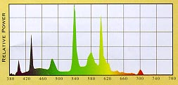
Light, like all forms of radiant energy, is represented on the electromagnetic spectrum. Traveling in waves, light is differentiated from other forms of radiant energy such as heat and X-rays by the frequency and length of its waveform. A narrow band on the spectrum is visible light, composed of different colors/wavelengths, from violet at 380 nanometers to red at 620-760 nanometers. An even balance of these light waves composes white visible light. To see this principle firsthand, look at a rainbow, which results from sunlight being refracted by droplets of moisture in the air, or simply shine a beam of white light through a glass prism to make a rainbow of colors appear on the other side. Visible light cannot be seen, however. If we turned on a flashlight in a dark room, the beam of light we are seeing is actually light being reflected from a multitude of dust particles in the air. Therefore, we see objects only when light is reflected or emitted from them. And that is how we see color. All objects are chemically oriented to absorb certain wavelengths of light and reflect others. The ones that are reflected are perceived by the human eye to be the color of the object. A red object being struck by visible white light will absorb all wavelengths except red, which is reflected, and so we see the object as red. A pure white object reflects all wavelengths and absorbs none. A pure black object absorbs all wavelengths and reflects none. This is where a great amount of art comes into lighting because few lamp types produce pure white light. Some lamps produce light that is saturated in blue and green, others red and yellow. A red object struck by light that contains only blue and green wavelengths would not appear red as if it were under sunlight. A low-pressure sodium lamp produces light saturated in yellow, which means that all objects struck by it will appear yellow, black or a shade of gray. The major lamp manufacturers all have literature and exhibits that demonstrate the effect of light on color. The slogan of one: "Color is how you light it." Metrics To understand how a lamp's light will affect the color of objects in the space, three metrics are used, including spectral power distribution, color temperature and color rendering. Spectral power distribution shows the visible light spectrum and the wavelength composition for the light from the lamp (see illustration). The spikes indicate that the light is stronger in revealing certain colors.
Color temperature, expressed on the Kelvin scale (K), is the color appearance of the lamp itself and the light it produces. According to the Illuminating Engineering Society of North America (IESNA), color temperature is "the absolute temperature of a blackbody radiator having a chromaticity equal to that of the light source." Imagine a block of steel that is steadily heated until it glows first orange, then yellow and so on until it becomes blue or bluish-white. At any time during the heating, we could measure the temperature of the metal in Kelvins (Celsius + 273) and assign that value to the color being produced, resulting in a "color temperature." Computer software performs this function for today's lamps, giving them a color temperature rating found in the manufacturers' literature. For incandescent lamps, the color temperature is a "true" value; for fluorescent and high-intensity discharge (HID) lamps, the value is approximate and is therefore called correlated color temperature. In the industry, both terms - - color temperature and correlated color temperature - - are often used interchangeably. The color temperature of lamps makes them visually "warm," "neutral" or "cool" light sources. Lamps with a lower color temperature (3500K or less) have a warm or red-yellow/orangish-white appearance. The light is saturated in red and orange wavelengths, bringing out warmer object colors such as red and orange more richly. Lamps with a mid-range color temperature (3500K to 4000K) have a neutral or white appearance. The light is more balanced in its color wavelengths. Lamps with a higher color temperature (4000K or higher) have a cool or bluish-white appearance. Summer sunlight has a very cool appearance at about 5500K. The light is saturated in green and blue wavelengths, bringing out cooler object colors such as green and blue more richly.
Once a color temperature is specified, use the spectral power distribution data to aid in selecting a specific lamp. Color rendering, expressed as a rating on the Color Rendering Index (CRI), from 0-100, describes how a light source makes the color of an object appear to human eyes and how well subtle variations in color shades are revealed. The higher the CRI rating, the better its color rendering ability. According to the IESNA, color rendering is the "measure of the degree of color shift objects undergo when illuminated by the light source as compared with the color those same objects when illuminated by a reference source of comparable color temperature." Imagine two objects, one red, one blue, that are lighted by a cool light source with a low CRI. The red object appears muted while the blue object appears a rich blue. Now take out the lamp and put in a cool light source with a high CRI. The blue object still appears a rich blue, but the red object appears more like its true color. Standard incandescent lamps enjoy a CRI rating of 100. Fluorescent lamps are in the 52-95 range, depending on the lamp. Advances in phosphor technology have enabled fluorescent and HID lamps to advance greatly in color rendering. As stated in the IESNA definition, to compare any two given lamps, they must have the same color temperature for the comparison to have any meaning. Specifying Color When specifying color characteristics for a lamp, numerous psychological factors must be considered depending on the lighting goals for the space. Here are a few general tips. Warm light sources are generally preferred for the home, restaurants and retail applications to create a sense of warmth and comfort, while neutral and cool sources are generally preferred for offices and similar applications to create a sense of alertness. In addition, in retail applications, color is a critical design decision because buyers need to be able to choose products of the correct color, both to enhance the chance of its sale and to reduce the chance of it being returned once the buyer gets outside and sees it under sunlight. In this or any other application where the occupant needs to see the right color, good color quality is essential. In other applications such as parking lots, color is not an important factor, so low-color-rendering lamps can be specified.
Light Guides ©2012 inter.Light, Inc. All Rights Reserved. Disclaimer |